In the age of smartphones, social media, and constant connectivity, our attention spans are dwindling faster than ever before. We’ve become masters of skimming, scrolling, and swiping, always on the lookout for the quickest route to the information we seek.
As a result, the landscape of web design and user experience is undergoing a profound transformation. Websites, once sprawling with content and cluttered interfaces, are evolving to cater to the craving for simplicity and efficiency.
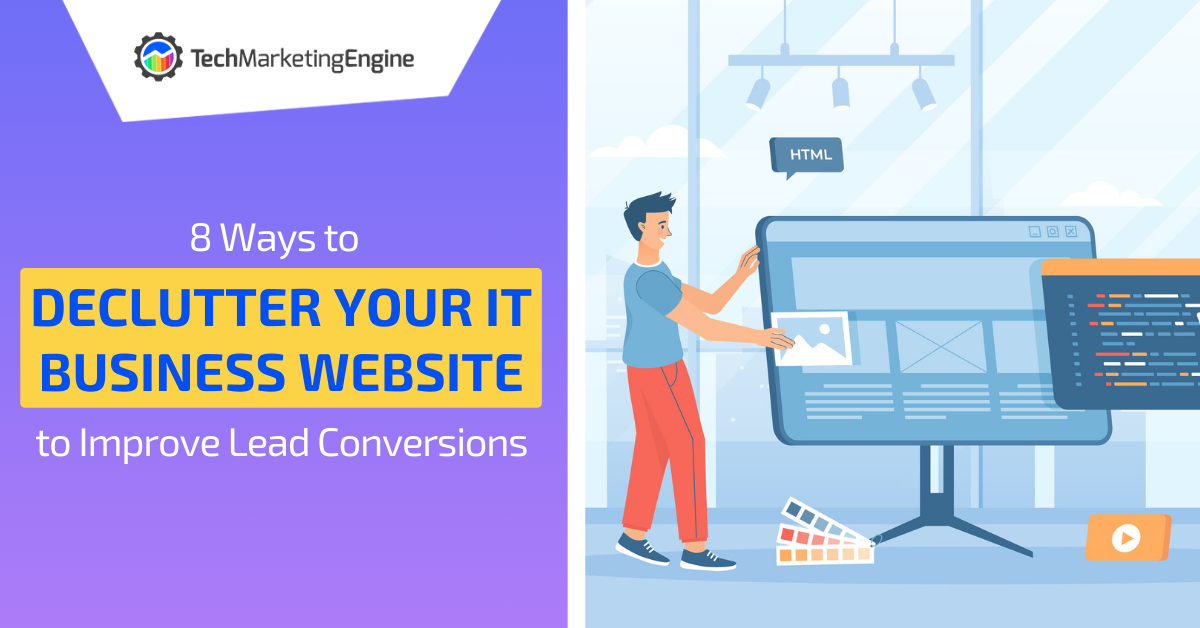
A cluttered website can be a significant roadblock to converting visitors into leads and clients. People tend to leave if they find a website confusing, or overwhelming. In this blog post, we’ll explore several effective ways for IT business owners to streamline their websites to encourage more lead conversions.
Why Do I Need to Declutter? My Website Looks Fine
You might be thinking, “My website looks just fine. Why do I need to declutter?” It’s a fair question. After all, you’ve put time and effort into crafting your digital presence, and it may seem counterintuitive to strip it down to the essentials.
However, the need for a clean and uncluttered website goes hand-in-hand with the changing landscape of user behavior. It’s more critical than ever to ensure a smooth and positive user experience, free from distractions, if you want to achieve your business growth goals.
To comprehend the urgency of decluttering your website, it’s crucial to first grasp the evolving psychology of web users in this fast-paced digital age. Our collective attention span is on a rapid decline, and it’s not hard to see why.
With an endless stream of information, entertainment, and distractions just a click away, we’ve become conditioned to process and discard content at an astonishing rate. It’s like speed-reading through the vast library of the internet, and if your website doesn’t provide a seamless and efficient experience, you risk becoming just another discarded chapter.

Think about your own online behavior. When you visit a website, what are you looking for? Chances are, it’s a specific piece of information, a product, or a solution to a problem.
Now, imagine encountering a website that bombards you with an overwhelming array of graphics, pop-ups, buttons, and text blocks, all vying for your attention simultaneously. Your initial reaction may be frustration, and if you can’t quickly find what you’re looking for, you’re likely to hit the “back” button and seek an alternative source.
76% of consumers say the most important design factor when visiting a website is how easy it is for them to find what they need.
So, while your website may indeed appear “fine” at first glance, it’s essential to dig deeper and see how you can streamline the visitor experience. Read on for several helpful things you can do.
Streamline Your Website with These Tips
Simplify Your Navigation Menu
A cluttered navigation menu can overwhelm visitors and make it difficult for them to find the information they need. You don’t have to present every option right away.
Start by reviewing your menu and simplifying it. Group related pages together and use clear, concise labels. Consider a dropdown menu for subcategories to keep the main menu uncluttered. Make sure essential pages, such as services, about us, and contact, are easily accessible from the menu.
Optimize Your Homepage
Your homepage is often the first impression visitors have of your business. Keep it clean and focused. You should be introducing your business and what you do on a high level, not trying to tell them everything your company does on one page.
Use a clear and concise headline that conveys your overarching value proposition. Highlight key services or solutions using eye-catching visuals and concise descriptions. Avoid cluttering the homepage with excessive text or too many competing elements. Instead, guide visitors to explore further through strategically placed calls-to-action (CTAs).
Simplify Content
Review the content on your website and eliminate unnecessary text and jargon. Make sure your messaging is clear, concise, and focused on addressing the pain points and needs of your target audience.
Use bullet points, subheadings, and short paragraphs to improve readability. Consider using visuals, such as infographics and videos, to convey information more effectively. Images and infographics can often get a point across much faster than a ton of text.
Tip: This is one area where ChatGPT can be of assistance. For example, if you have two paragraphs of text that you need to consolidate into a few sentences, paste it into ChatGPT and ask it to reduce the word count by about 70%. In many cases, it can give you some very concise language that still gets the point across.
Read: Why Shouldn’t I Let ChatGPT Write My MSP Blog Posts?
Implement Clear CTAs
Calls-to-action (CTAs) are essential for guiding visitors toward taking desired actions, such as contacting your MSP or downloading a resource. You’d be surprised how many MSP websites talk about their services, but don’t direct the visitor to contact them. Even if you have a “contact us” large at the top of your navigation, you should still direct the website visitor to what their next step is at the end of each page.
Ensure that your CTAs are visually distinct, placed strategically throughout your website, and use compelling language. Make it clear what visitors will gain by clicking on a CTA, whether it’s accessing valuable content or requesting a consultation.
For example:
- Instead of this: Contact us today!
- Use this: Contact us today to improve your digital processes!
Reduce Form Fields
Lead generation forms are a vital part of converting visitors into leads. However, overly long or intrusive forms can deter potential clients. If you ask too many questions, they’ll just give up and not bother submitting your form.
Review your forms and ask for only essential information. Minimize the number of required fields, focusing on collecting the information necessary for initial contact or qualification. You can always gather more details as your relationship with the lead develops.
37% of people will abandon a form if it includes phone number as a required field.
For email newsletter forms, consider having just two fields, one for first name and one for email address. Of course, for a general contact form or assessment request form, you may need to collect more data, such as last name, company, and phone number. Tailor what you collect to the form’s purpose, keeping in mind that the more fields you add, the higher the risk of form abandonment.
Focus on Your Value Proposition
Your value proposition is the main reason why visitors should choose you over your competitors. Is it getting lost in all the text telling them in detail about everything you offer?
Prominently display your value proposition on your home page, preferably above the fold. It should be clear, concise, and compelling, and it should answer these questions:
- What do you do?
- Who do you serve?
- How do you help them?
- What makes you different?
Use Whitespace & Visual Hierarchy
Whitespace helps to create a clean and spacious look on your website. People may not even know why, but a site with plenty of whitespace can make them feel more at home and less agitated than a site brimming with multiple elements. Use whitespace to help guide visitors’ eyes to the most important things you’d like them to see or do.

Visual hierarchy is the way you arrange and emphasize elements on your website according to their importance and relevance. You can use visual hierarchy techniques such as size, color, contrast, alignment, and proximity to draw attention to your key messages, calls to action, and benefits.
Optimize Your Images & Videos
Images and videos can enhance your website by adding visual appeal, personality, and credibility. However, if they are too large, too many, or irrelevant, they can also clutter your website and slow down your page loading speed.
To optimize your images and videos, you should:
- Use high-quality images and videos that are relevant to your content and brand
- Compress your images and videos to reduce their file size without compromising their quality
- Use responsive images and videos that adapt to different screen sizes and devices
- Use alt text for your images and captions for your videos to improve accessibility and SEO
Improve Sales by Improving Visitor Experience
By decluttering your website, you can create a better user experience for your visitors, increase your credibility and trustworthiness, and improve your lead conversions.
If you need help with streamlining your website or improving any other aspect of your online presence, contact us today. We are a team of experienced MSP marketing experts who can help you grow your IT business.
Have you ever found a website overwhelming and cluttered? Share your feedback in the comments!
Leave a Reply